


Home / Newsletters / March 2026
By now you’ve likely heard about as much as you ever want to hear about accessibility in Canvas. We’ve all spent an extraordinary amount of time recently working on finishing this monumental task to review and update all Canvas content. Now it is time to shift our approach. It’s not about finishing a task anymore, now we have to look at our approach to curriculum design and incorporate the good design principles we’ve learned to make sure our courses maintain a higher standard going forward.
Here are a couple principles to apply to elevate your curriculum design.
Several of the accessibilty requirements that we’ve reviewed recently also translate directly into good design principles.
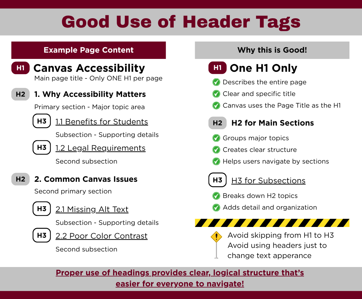
A clean and simple layout improves the professional look of your content, and it also makes it easier to understand. Proper use of header tags and other format options supports your students and makes your content more approachable.
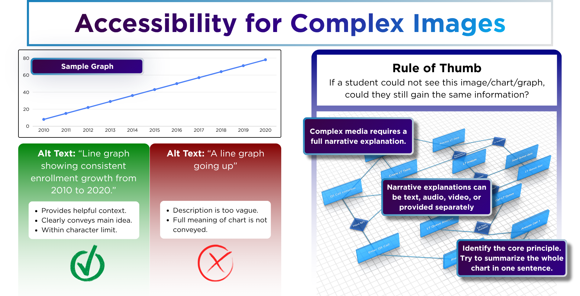
Images and videos are great ways to add interest and make your course content more engaging. However, charts, graphs, and even videos often present complex topics and information. Providing additional resources for students can help them more fully benefit from media.
This ranges from simple alt text on images, to full transcripts for videos. Additionally, presenting the same information in multiple formats is also beneficial. Complex charts, graphs, or tables in particular require in depth narrative explanations to make sure students fully understand the content.
Adding color to your content has many benefits. You can use it to provide additional clarification or highlight important content. However, too many different colors or the wrong color combinations can actually create barriers to learning and leave students lost or confused. It’s best to focus on a few colors with clear meanings, and that all content is still clearly visible with sufficient contrast.
Including external resources is another good option for enhancing your course content. However, these links can sometimes be missed or skipped if their content or purpose is not clear. To help provide clarity, your links should show the destination instead of focusing on the action. Using language like “click here” might seem natural, but by themselves often seem vague.
Consider for example, “Download the document here”, versus, “Review the Annual Report PDF.” The first might seem ok, but if you have no other context, it may not be clear what document you are downloading. This becomes much more clear with the second link text.
| Cookie | Duration | Description |
|---|---|---|
| cookielawinfo-checkbox-analytics | 11 months | This cookie is set by GDPR Cookie Consent plugin. The cookie is used to store the user consent for the cookies in the category "Analytics". |
| cookielawinfo-checkbox-functional | 11 months | The cookie is set by GDPR cookie consent to record the user consent for the cookies in the category "Functional". |
| cookielawinfo-checkbox-necessary | 11 months | This cookie is set by GDPR Cookie Consent plugin. The cookies is used to store the user consent for the cookies in the category "Necessary". |
| cookielawinfo-checkbox-others | 11 months | This cookie is set by GDPR Cookie Consent plugin. The cookie is used to store the user consent for the cookies in the category "Other. |
| cookielawinfo-checkbox-performance | 11 months | This cookie is set by GDPR Cookie Consent plugin. The cookie is used to store the user consent for the cookies in the category "Performance". |
| viewed_cookie_policy | 11 months | The cookie is set by the GDPR Cookie Consent plugin and is used to store whether or not user has consented to the use of cookies. It does not store any personal data. |